Avalon’s Dark Mode Guide
Executive Summary
- While most emails are still opened in standard “Light Mode,” it’s important to start optimizing for Dark Mode because more and more users are adopting it, and it’s not going away anytime soon.
- Optimizing your emails for Dark Mode can improve the overall experience for users with visual impairments as well as users who simply prefer Dark Mode.
- Dark Mode factors into Avalon’s larger efforts to improve accessibility standards in our clients’ emails.
- There are several steps you can take now to help optimize your emails for Dark Mode.
What is Dark Mode?
|
||||
| Television screens, phone screens, computer screens, tablet screens—now more than ever, most of us are spending our days looking at screens. It comes as no surprise, then, that millions of people are turning to Dark Mode to reduce the strain of our new technology-driven lives.
Dark Mode, also known as Dark Theme or Night Mode, is a feature that automatically inverts the colors on a device screen, transforming the typical light background and black text to a dark background with white text. Originally, a dark screen and white text were the default for computers, but developers transitioned to a lighter screen to replicate the experience of reading on physical paper. Now, users are increasingly opting back to the original Dark Mode color schemes to reduce eye strain, preserve battery life, and cut down on blue light exposure. According to a recent study by Litmus, 36% of emails opened with iOS (Apple’s mobile operating system) were opened in Dark Mode, while only 7.5% of emails opened with MacOS (Apple’s desktop operating system) were opened in Dark Mode. Email on Acid also conducted a recent study and determined that 11.5% of subscribers used Dark Mode to open emails—this includes both mobile and desktop subscribers.1 The technology to track Dark Mode has its limitations, and therefore digital marketers are unable to know for certain the exact percentage of Dark Mode users at any given time. However, findings from pre-deployment platforms like Litmus and Email on Acid suggest the number of people using Dark Mode to access content is on the rise, and therefore Avalon recommends that email designs adapt to this growing trend. Dark Mode for AccessibilityOptimizing emails to display well on Dark Mode is a great way to increase the accessibility of your content. At least 2.2 billion people, including 14 million Americans, experience some form of vision impairment. A good color contrast ratio, as facilitated by Dark Mode, can drastically improve readability on any display. Because Dark Mode alters how colors appear on screen, if this user experience is not considered within the initial framework of your email design then you could be limiting the ability of your user to read your email with ease. The best way to make sure content remains as accessible as possible when adapting for Dark Mode is to follow the Web Content Accessibility Guidelines (WCAG). Avalon references this shared standard for web content accessibility as we continue to work toward incorporating appropriate contrast ratios in our design materials. The latest version of the guidelines, WCAG 2.1, requires a contrast ratio of at least 3:1 for graphics and user interface components (such as form input borders). In WCAG, large text is defined as 14 point and bold or larger, or 18 point or larger. Maintaining a good color contrast ratio will ensure that your content remains accessible for everyone, regardless of impairment or user device. Most importantly, it ensures that users who can’t see the full color spectrum are able to read your content. Dark Mode can also help those who experience photophobia—a condition that induces migraines when a person is exposed to bright light—by reducing the intensity of brighter colors, thus reducing the risk of triggering a painful migraine. And the more than 50 million Americans who suffer from a sleep disorder could also benefit from Dark Mode–adapted content, as it’s known to reduce eye strain for those who use electronics before bed. Overall, optimizing content for Dark Mode (we’ll go into even greater detail in the following pages) is a great way to create and share inclusive and accessible content, improving the overall experience and boosting response among those who prefer it. Email Clients that Support Dark ModeWhile not all email platforms offer Dark Mode, a lot of the most popular platforms do. The following list of clients and apps allow for Dark Mode in some capacity:2 Mobile Apps
Desktop Clients
Web Clients
The Three Types of Dark ModeCurrently there are three different treatments that email servers use to apply Dark Mode to email content. No Color Change Some email servers enable Dark Mode View but make no changes to how HTML emails are rendered. That means emails with HTML will look exactly the same, regardless of whether they’re viewed in Light Mode or Dark Mode. Apple Mail currently uses this method of customization, with some exceptions. Text-only emails with no HTML or images, for example, will be fully converted to a Dark Mode theme.3 Email clients in this category:
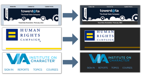
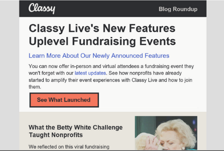
Partial Color Invert The second default Dark Mode theme uses a partial color invert. This means that the Dark Mode setting detects only areas with light backgrounds and inverts them so that light backgrounds become dark, while dark text becomes light. Typically, this default mode also leaves areas with already-dark backgrounds alone.
In this example, lighter colors flip to darker colors, but colors that were dark to begin with stay the same. The black background of the logo-header remains black, as does the black border around the “See What Launched” button. Partial Color Invert also allows for some customizations through HTML and CSS coding that can indicate specific colors to use when inverting or areas to be left alone. Email clients currently in this category include:
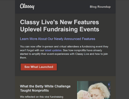
Full Color Invert This version of Dark Mode impacts both dark and light color schemes. Intentionally dark designs will be forced to become light. Currently, the Gmail iOS app and Outlook 2019 (Windows) use this form of Dark Mode. Take a look at the same email above, now treated with a Full Color Invert:
All colors have flipped, including the dark background in the logo-header (making it difficult to read the white logo) and the black border around the “See What Launched” button. A full color invert can cause design issues by affecting emails that have intentionally dark design elements, such as a dark background, and converting them to a lighter color that wasn’t intended. Email clients in this category:
Custom Options In addition to these common default settings, there are also ways to adapt to Dark Mode through coding. For example, you could use tags to ensure that Dark Mode is enabled for users who prefer that feature, or code in different images or logos based on usage of Light or Dark Mode, though this option is more time-intensive, costly, and available only for certain email providers. The best way to ensure an optimized view of your email content is to test emails in Dark Mode using email testing software such as Email on Acid or Litmus and to optimize email content using the following steps: Optimizing for Dark Mode
Making sure content is optimized as much as possible for Dark Mode is key to ensuring that your content remains accessible. There are many steps we can take now to adapt to the Dark Mode trend before investing in updates to email stationery, including:
Good:
Needs improvement:
Good:
Needs improvement:
Following each of these steps can help optimize your content for Dark Mode across a variety of email platforms and devices. ConclusionDark Mode is a widely used feature on the most popular email platforms. With more and more people switching over to it every day, Dark Mode is clearly here to stay. Now is a great time to experiment with different color schemes to see what looks best in both Light and Dark modes. It’s also a great time to try Dark Mode–inspired designs and see how your audience responds. Keep in mind that Dark Mode is still a new feature—the different ways that major email platforms treat Dark Mode and the options for customizing and optimizing content will likely continue to evolve in the coming years. Using the steps outlined above in the Optimization section will ensure that you’re prepared to accommodate the growing segment of your audience that has adopted Dark Mode. It will also help your organization create content that is more accessible for everyone, including visually impaired audience members who use this increasingly popular feature.
|